Chart
dReveal's Dashboard Designer empowers users to create detailed and customized reports, generating dynamic charts that provide deep, real-time insights into their data. In Grid Chart, you can intuitively analyze and visualize trends, tailoring reports to your specific needs thanks to its wide range of customization options.
How to Create a Chart Filter:
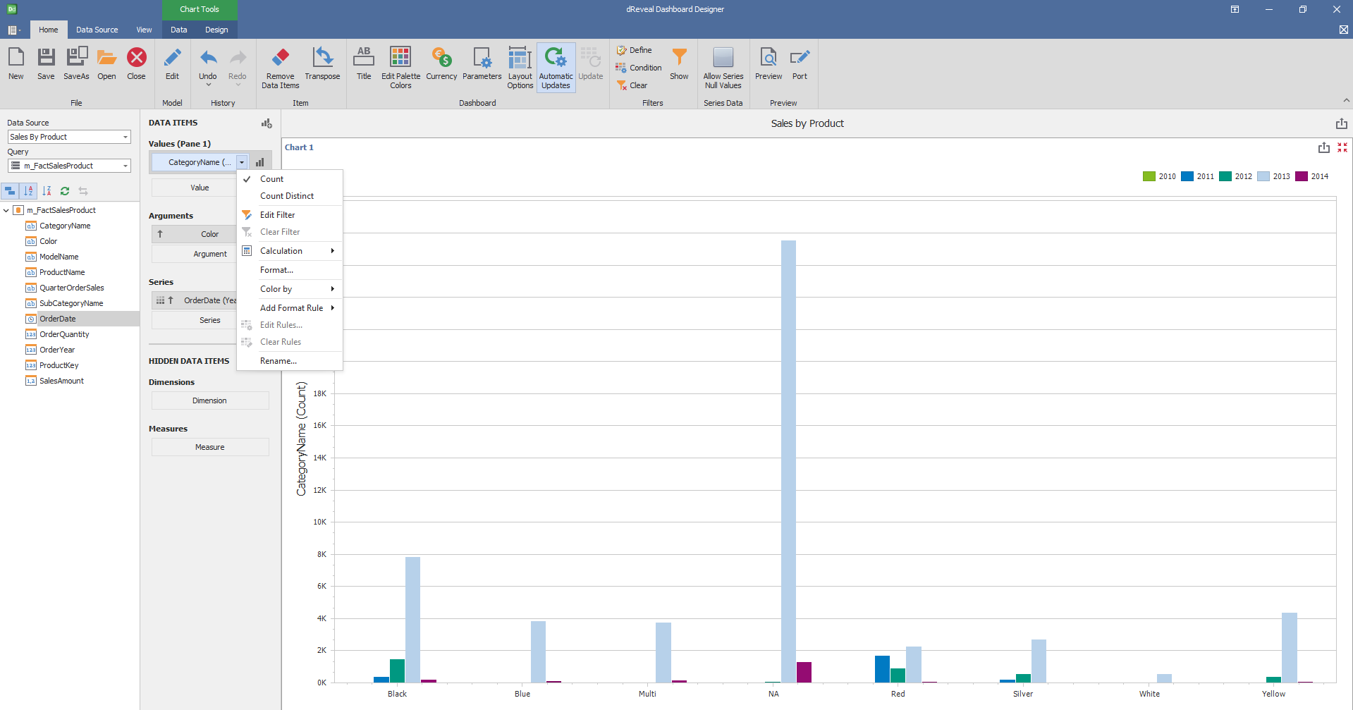
To create striking, customized visualizations, start the Dashboard Designer. You can begin a new project or work on an existing one. Once inside, select the "Chart icon". Then, drag and drop the dimensions and measures you want to analyze from the main view to the "Columns" section under DATA ITEMS. This simple action allows you to build a wide variety of charts, from simple bars to complex scatter plots, tailored to your specific needs.

Dashboard Designer also provides various options to customize the 'Chart' based on the data type displayed in each column. Below is a general overview of the different options you can apply to your Chart Designer.
Column of type String

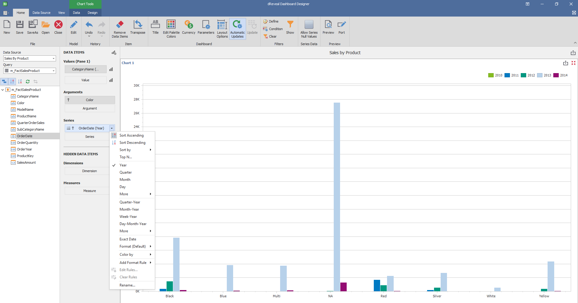
Column of type Date:

Data
Target Dimensions
| Options | Description |
|---|---|
| Arguments | These are the specific values within a dimension. Arguments are the elements used to filter and segment data. |
| Series | These represent the different measures or metrics associated with a dimension. |
| Points | These are the individual intersections of arguments and series. |

Fields
| Options | Description |
|---|---|
| X Fields | Specifies a criterion that defines what data should be displayed on the X axis of the chart. |
| Y Fields | Specifies a criterion that defines what data should be displayed on the Y axis of the chart. |
| DropDown Text label | Change the text above the selector. |
| Enable Swap | Activates the position exchange of definitions on the chart. |
| OrderXYFields | Allows you to customize the sorting of fields, specifying the sorting criteria (ascending or descending) and the priority of each field. |

Bind
| Options | Description |
|---|---|
| Bind | It is used to visually combine specific graphs, creating a more complete and coherent representation of the data. |

Visibility
| Options | Description |
|---|---|
| Display Full Data | By selecting this option, you can visualize complete data on the web, which is essential for turning data into actionable insights. |

Properties
| Options | Description |
|---|---|
| Drill Through | When you select the Drill Through element, a new window appears to indicate its properties. |

Filter Exclusive
| Options | Description |
|---|---|
| Filter Exclusive | Exclusive filters allow for the isolation and analysis of specific data segments within a chart. These filters function as a customized lens, enabling users to focus on the most pertinent information for their analysis. |

Design
'Designer Chart' has a variety of options in the 'Design' tab to customize your chart. Next, we will show you the different options you can apply to your Chart.
Diagram
| Options | Description |
|---|---|
| Rotate | Rotate the diagram at 90º. |
| X-Axis Settings | Customize various X-Axis Settings, such as the visibility and Axis Title. |
| Y-Axis Settings | * Customize various Y-Axis Settings, such as the visibility, title and displayed range.* |

Legend
| Options | Description |
|---|---|
| Show Legend | Show the legend that helps end-users identify chart elements. |

Serie Types
| Options | Description |
|---|---|
| Bar | Specifies bar-separated data values. |
| Stacked Bar | Specifies the data by separating the values on the same bar. |
| Full-Stacked Bar | Specifies the data at 100% by separating the values on the same bar. |

Coloring
| Options | Description |
|---|---|
| Global Colors | Use a global scheme to color elements of a dashboard item. |
| Local Colors | Use a local scheme to color elements of a dashboard item. |
| Edit Colors | Specify colors used to color elements of a dashboard item. |

Edit Legend
| Options | Description |
|---|---|
| Legend Text Config | * Demonstrates which combinations will be shown in the legend texts. * |

